To the Dark Side
If you've got dark-mode enabled on your system or browser ,you might be seeing the website differently than normal. I've been mucking around as a way of learning some of the newer CSS and what's possible these days. One of the things I've been keen on is moving to a more "vanilla" approach to my websites – less reliance on frameworks, addons and plugins. So I've been trying to suss out what you can do these days with just plain old vanilla CSS.
As a designer, one of the things that I've relied heavily on in the past has been SASSto handle the grunt work of creating colour systems - all of the darker and lighter tones for each of the available colours in your palette. That can be done now using the native colour-mixing that's available in CSS. To complement that, I've been looking into making more "colourful" yet accessible use of colour across my sites. I love colour - huge, big, blocky chunks of it - and often the more eye-wateringly lush and juicy the better. I started this by updating the colours I used on the Learning Types site. One of the tricky things in a colour system is tachievingconsistency across the range. If you use yellow , the palette quickly becomesmuddied into poo-brown. In steps the OKLCH for creating my colour system.
There are a great number of colour systems – ways of codifying the hues, tones, lightness and darkness of the colours we see. Many on the web are used to the hex-codes like #ff0e69 and #ffae2c you see around the place. You might be familiar with RGBA where you can assign values to the red, green, blue and alpha (transparency) channels. Theres HSL, which does appear on this very website - which is your Hue, Saturation and Lightness. OKLCH is one of those - you define the values for the Lightness, Chroma and Hue. This is all nicely explained on OKLCH in CSS: why we moved from RGB and HSL:
oklch()is a new way to define CSS colors. Inoklch(L C H)oroklch(L C H / a), each item corresponds as follows:
Lis perceived lightness (0-1). “Perceived” means that it has consistent lightness for our eyes, unlikeLinhsl().Cis chroma, from gray to the most saturated color.His the hue angle (0-360).ais opacity (0-1or0-100%).
The big thing for me was this idea of "perceived" - especially because I'd been using darken() and lighten in Sass and while they might be mathematically correct, there was alway a lot of tonal differences across the colour palette. OKLCH improves that quite a bit, and while I still might tinker, it's reduced the massive variations I am used to.
So I wanted an excuse to explore OKLCH, but also some of the new variables and functions possible in CSS. Down the rabbit hole I went, but what I wanted to share was where I ended up. I've now built a colour system I am happy with – I haven't applied it to anything yet, but I've started incorporating it here. What I did was break down my OKLCH into its constituent parts.
For example I've tweaked the colour palette here to use a tint of my Soulyellow:
--hue-base: 73;
--chroma-base: 0.005;
These are now CSS variables that I can use. So I plug them into a repeatable palette:
--color-base-50: oklch(0.985 var(--chroma-base) var(--hue-base));
--color-base-100: oklch(0.960 var(--chroma-base) var(--hue-base));
--color-base-200: oklch(0.920 calc(var(--chroma-base) * 1.2) var(--hue-base));
--color-base-300: oklch(0.840 calc(var(--chroma-base) * 1.5) var(--hue-base));
--color-base-400: oklch(0.720 calc(var(--chroma-base) * 1.8) var(--hue-base));
--color-base-500: oklch(0.580 calc(var(--chroma-base) * 2.0) var(--hue-base));
--color-base-600: oklch(0.450 calc(var(--chroma-base) * 1.8) var(--hue-base));
--color-base-700: oklch(0.340 calc(var(--chroma-base) * 1.5) var(--hue-base));
--color-base-800: oklch(0.230 calc(var(--chroma-base) * 1.2) var(--hue-base));
--color-base-900: oklch(0.150 var(--chroma-base) var(--hue-base));
--color-base-950: oklch(0.095 var(--chroma-base) var(--hue-base));
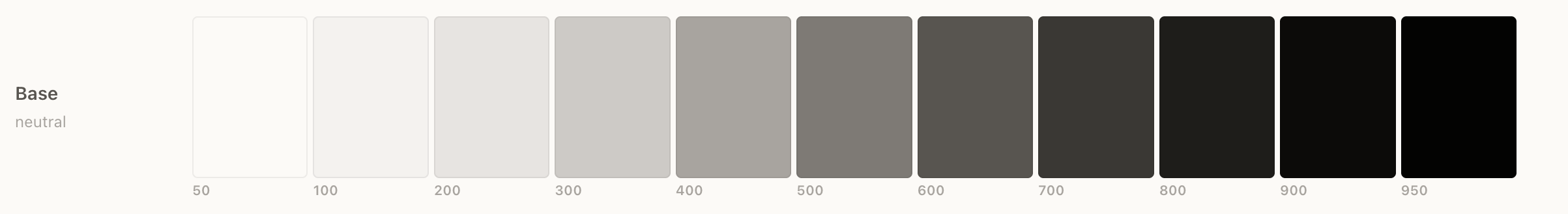
And now I have a full palette for those colours. I'm using the calc function to change the hue and chroma across the range to provide a better spread and consistency alongside the other colours in the palette.
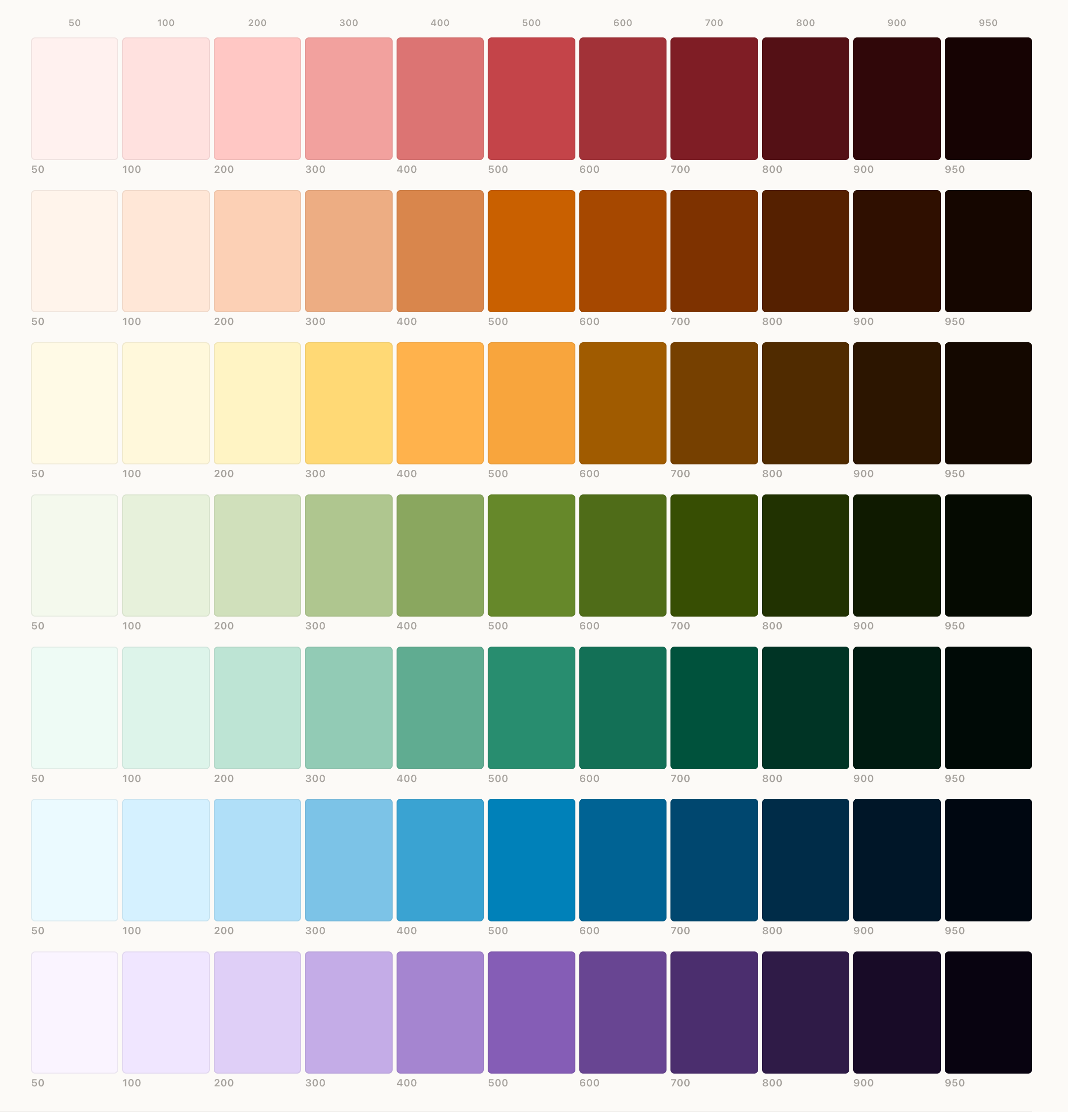
I mean – look at those beauties!! Look at the consistency across each level!
The other nifty CSS feature I've started adding to the site is a light-darkfunction. So instead of color[1] having a single assigned value, you can have one colour for light mode and one for dark.
So the background of this page element is written
background-color: light-dark(var(--color-base-200), var(--color-base-950));
Now for the site, I am still using the 11ty Rocks Sass + LightningCSS which I found out does some nifty backwards compatible tweakery, so your source code might not show that – but that's what I write. And it just works!
So I spent last night and this morning tweaking things across the site to make dark mode work. There are a few bits I need to work on (and if you see them let me know!) but I'm well underway on making the site more Dark Friendly.
I am sticking to the American spelling as it's part of the mental model I've had to build to work on the web all these years and finding errors in my code because I've tried to spell colour correctly. ↩︎
Comments
Comment on this blog post by publicly replying to this Mastodon post using a Mastodon or other ActivityPub/Fediverse account.
No known comments, yet. Reply to this Mastodon post to add your own!